
Designing CSS input fields or forms can be tricky. Whether you are creating forms in table with CSS or trying to find CSS styles for forms, this is the right CSS form post for you. Designing CSS forms isn’t always easy and sometimes it seems down right impossible.
3 things I don’t like about Forms
1. Form Labels
Sometimes as a designer it feels like forms are controlling me (the designer) as opposed me designing forms. Take for instance the pattern of having a label next the input box. To me it doesn’t look right, though yes I have clients that do it and even my contact form I have done it. There’s only so much time in the day. To this designer it’s a total waste of space.
2. Form Fonts
As designers we have a limited palette of font stacks we can work with outside of importing fonts. We’ll leave the latter for a different post. Off the shelf form elements are not typographically designed. The forms are unpolished and designers should put more design thought into the font choice, color, weight, kerning etc.
3. Form Padding, Margin, Effects
One of many design mistakes have to be proper usage of margin and padding. Simple design principles are their to help us not harm us. Grid layout is important to understand too and goes along the same vein of having the proper amount of padding and margin. Another part that bugs me is the fact that forms are just bla. There is no “form design” it’s just a start. Consider the form as a start and carve out the time for spreading the CSS love on input, forms, etc.
CSS Input
CSS input is the title of this post and is play on words. Get it? Anyway, we want think outside of the form box. I know it’s cliché, but bear with me. In our following example we’ll create a dazzling search form or at least something with thought propelling the form design. Let’s start with the search input field.
1. Create a search field, label it, and submit button. Like this:
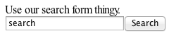
I don’t know about you, but the above form is just oozing excitement.
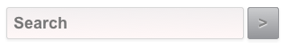
2. Let’s start really designing!
Delete the label, delete input value of “search”, and change the input submit button to something shorter. For this example I will use “>”. Like this:
OK, it’s looking a little better.
3. Let’s typography, padding, margins, borders, and more
Let’s change the default font for the search field and submit button to an Arial font-stack and add the details that help uplift your form design. You can use the form selectors available directly and should if form elements are global, yet that’s your choice. Here’s how I did it for this example:
Here’s the code:
Start with Search Field
input[type="text"] {
1. Add typography
font-family: Arial, sans-serif;

font-size: 18px;

font-weight: bold;

color: #777777;

line-height: 0;
2. add width, padding, margin, and border
width:250px;

padding: 6px;

margin: 0px;

border: 1px solid #d7d7d7;
3. Add slightly rounded edges
-webkit-border-radius: 3px;

-moz-border-radius: 3px;

border-radius: 3px;
4. Let’s Create a shadow effect
-webkit-box-shadow: 0px 1px 1px 2px #f3f3f3;

-moz-box-shadow: 0px 1px 1px 2px #f3f3f3;

box-shadow: 0px 1px 1px 1px #f3f3f3;
5. Add a gradient background
background: #f2eff0;

background: -moz-linear-gradient(top, #f2eff0 0%, #fff7f7 100%);

background: -webkit-gradient(linear, left top, left bottom, color-stop(0%, #f2eff0), color-stop(100%, #fff7f7));

background: -webkit-linear-gradient(top, #f2eff0 0%, #fff7f7 100%);

background: -o-linear-gradient(top, #f2eff0 0%, #fff7f7 100%);

background: -ms-linear-gradient(top, #f2eff0 0%, #fff7f7 100%);

background: linear-gradient(top, #f2eff0 0%, #fff7f7 100%);

filter: progid:DXImageTransform.Microsoft.gradient( startColorstr='#f2eff0', endColorstr='#fff7f7', GradientType=0 );

}
Add hover & focus effects
input[type="text"]:hover, input[type="text"]:focus {
1. Add hover typography
color: #333;
2. add hover border
border: 1px solid #333;
3. Add hover gradient background
background: #f2eff0;

background: -moz-linear-gradient(top, #f2eff0 0%, #fff7f7 100%);

background: -webkit-gradient(linear, left top, left bottom, color-stop(0%, #f2eff0), color-stop(100%, #fff7f7));

background: -webkit-linear-gradient(top, #f2eff0 0%, #fff7f7 100%);

background: -o-linear-gradient(top, #f2eff0 0%, #fff7f7 100%);

background: -ms-linear-gradient(top, #f2eff0 0%, #fff7f7 100%);

background: linear-gradient(top, #f2eff0 0%, #fff7f7 100%);

filter: progid:DXImageTransform.Microsoft.gradient( startColorstr='#f2eff0', endColorstr='#fff7f7', GradientType=0 );

}
Button
input[type="button"] {
1. Add typography with text shadow
font-family: Arial, sans-serif;

font-size: 18px;

font-weight: bold;

color: #848484;

text-shadow: 0px 1px 1px #fff;

line-height: 0;
2. add width, padding, margin, and border
width: 35px;

padding: 5px;

margin: 0px;

border: 1px solid #95969a;
3. Add cursor
cursor: pointer;
4. Add slightly rounded egdes
-webkit-border-radius: 3px;

-moz-border-radius: 3px;

border-radius: 3px;
5. Let’s Create a shadow effect
-webkit-box-shadow: 0px 1px 1px 2px #f3f3f3;

-moz-box-shadow: 0px 1px 1px 2px #f3f3f3;

box-shadow: 0px 2px 1px 1px #f3f3f3;
6. Add a gradient background
background: #cbccce;

background: -moz-linear-gradient(top, #cbccce 0%, #95969a 100%);

background: -webkit-gradient(linear, left top, left bottom, color-stop(0%, #cbccce), color-stop(100%, #95969a));

background: -webkit-linear-gradient(top, #cbccce 0%, #95969a 100%);

background: -o-linear-gradient(top, #cbccce 0%, #95969a 100%);

background: -ms-linear-gradient(top, #cbccce 0%, #95969a 100%);

background: linear-gradient(top, #cbccce 0%, #95969a 100%);

filter: progid:DXImageTransform.Microsoft.gradient( startColorstr='#cbccce', endColorstr='#95969a', GradientType=0 );

}
6. Add hover & effects to button
input[type="button"]:hover {

background: #95969a;

background: -moz-linear-gradient(top, #95969a 0%, #cbccce 100%);

background: -webkit-gradient(linear, left top, left bottom, color-stop(0%, #95969a), color-stop(100%, #cbccce));

background: -webkit-linear-gradient(top, #95969a 0%, #cbccce 100%);

background: -o-linear-gradient(top, #95969a 0%, #cbccce 100%);

background: -ms-linear-gradient(top, #95969a 0%, #cbccce 100%);

background: linear-gradient(top, #95969a 0%, #cbccce 100%);

filter: progid:DXImageTransform.Microsoft.gradient( startColorstr='#95969a', endColorstr='#cbccce', GradientType=0 );

}
I know it’s a lot of code. However, I will chose code over images whenever I can get away with it. Also, we haven’t gone into browser compatibility though for the most part modern broswers will look the same. Yet, as always IE is the thorn in the side of everything.
But there’s still a problem. When clicking on the field in the example here the search field doesn’t clear. Well, the reason is we haven’t told it to clear. We can do this more than one way but I am going to use good old JS to clear this. Problem fixed.
There are tons of resources online about form design and I guess this is one more for you to bookmark or to, ahem, tweet. Keep in mind as well that it isn’t just HTML, JavaScript, and forms or CSS as separate to each other. It’s all one big ball of (form design) wax. So the idea is to get the creative juices flowing and sharpen your form design techniques. It’s important to note that usually users interface forms when either they are purchasing or contacting an entity. So put you design caps on, because forms matter. Source code is available at the end of this post.

Simon is a Product Designer and Front End Dev with over 20 years of experience. He started as a graphic designer and illustrator coding his first website in 1996. He has worked with brands like Publix, Microsoft, and Discovery Channel.